

Elevate Your Family Session with Joyful, Bold Colours - Hamilton Family Photographer
- Linda
- Feb 9
- 3 min read

When planning your next family session, you might be tempted to stick with "safe", neutral outfits. Maybe you feel like bold, joyful colours will clash with the emotional tone you want to capture. And you would be right in thinking that styling neutral colours is easier to achieve, and harder to go wrong with. However, I think you may want to stop and consider the possibility of colour one more time. As a Hamilton family photographer, I have almost nine years experience helping families select outfits for their sessions, and while most do opt for soft neutral shades, it's always exciting when a family is willing to push the envelope and try out some bolder options! The truth is, when done well, colour can enhance the soulful, emotive tone of the images and instantly bring a fresh, playful energy to your family photos.
Why Choose Bold Colours for Family Photo Outfits?
Many families default to neutral or muted tones for their family photos, thinking these colours keep the focus on faces and emotions. While neutrals definitely have their place, adding joyful, bold colours can:
Create visual interest that draws the eye to your family’s unique personality.
Reflect your family’s energy and spirit, making the photos feel more alive.
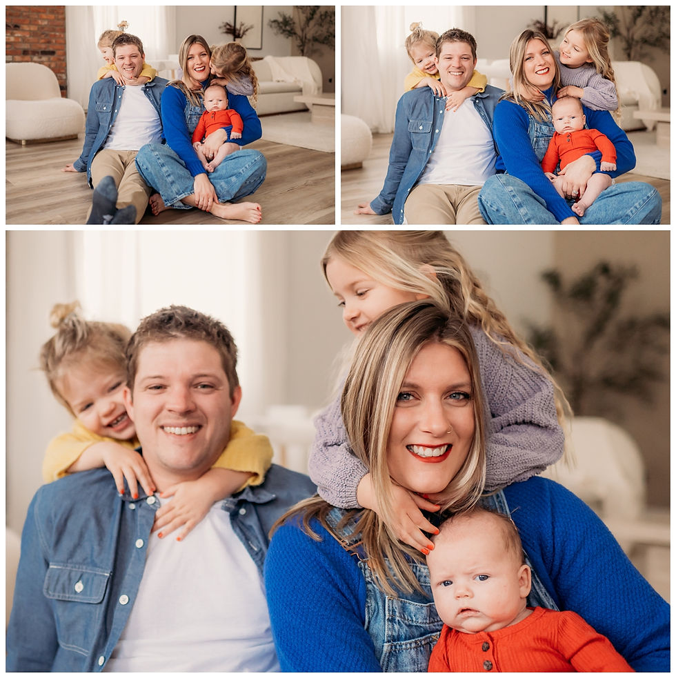
Complement colours in your natural settings or create pops of colour to stand out against neutral backdrops, as shown in these studio-shot images.
Help each family member stand out while still looking cohesive together.
In these images the bold, primary colours complement each other beautifully. Each colour is striking on its own, but when put together they work in harmony without overpowering each other. Repeating colours, such as the red onesie, red, lips and red nails, also help tie everything together cohesively.
How I Capture Soulful and Playful Moments Together
As a lifestyle photographer, I specialize in creating a balance between emotive and playful images during your family session. Bold colours don’t mean the photos lose their depth. Instead, they add layers of expression. Here’s how I approach it:
I guide families through natural interactions that reveal genuine emotions like laughter, tenderness, and connection.
I use the colours in your outfits to frame and highlight these moments, making the images pop.
I capture a mix of candid and posed shots, so you get a variety of moods - from sweet and quiet to joyful and lively.
This approach ensures your family photos tell a full story, showing both the love and the fun you share.
Tips for Choosing Family Photo Outfits with Bold Colours
Here are some practical tips for incorporating bold colours into your family session styling:
Pick a colour palette with 2-3 main colours that complement each other. For example, mustard yellow, navy blue, and soft grey work beautifully together.
Mix textures and patterns carefully. A gingham dress paired with solid-colour shirts can add interest without clashing. If you're feeling brave and want to experiment with mixing multiple patterns, try combining patterns of different scale and style - for example, a wide stripe mixed with a tiny floral pattern. Be sure to use mostly solids, though, to avoid pattern overwhelm.
Consider the location of your session. Bold colours look best in urban environments, in homes or studios with like colours in the decor, and in any location with mostly neutral backgrounds.
Coordinate but don’t match exactly. Let each family member express their style within the chosen palette.
Avoid overly bright and neon colours that can reflect unflatteringly on skin.
Choosing joyful, bold colours for your family photo outfits doesn’t mean sacrificing the emotional depth of your images. It means embracing your family’s vibrancy and creating photos that feel both heartfelt and full of life! Check out these images, then let me know in the comments: are you ready to incorporate more bold, joyful colours into your next family session?


Comments